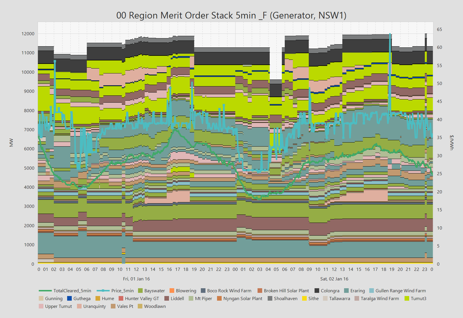
The MOS stacks all bids in a region from cheapest at the bottom to most expensive at the top. The individual bands are colorised optionally by portfolio, fuel type or station. By overlaying region generation we get a simplistic view of the marginal player in the market and by looking at how the bids move around from one dispatch interval to the next we can see how players are reacting to market events.
In this example NEO is showing the flow on an interconnector, the export and import limits and for each limits 5min period the binding constraint. The constraint is identified in the legend and provides a "shade" or thicker background colour to the limit line. CLicking on the constraint in the legend highlights where it occurs on the chart.
.png)
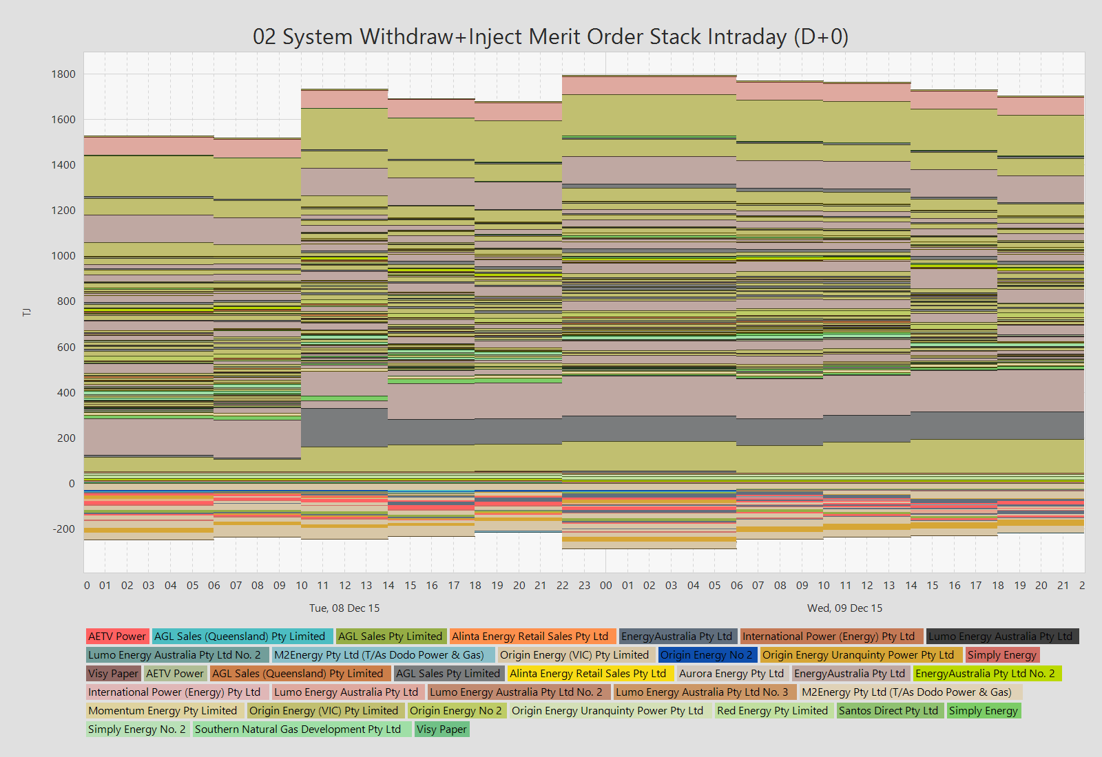
The NEO suite visualises many types of bid stacks but in this case we have a report that highlights NEOs ability to display both bids and offers in the one chart. This chart also shows the optionally compressed legend which is useful with many legend items.
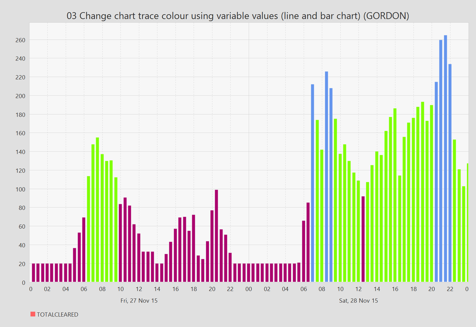
In this simple bar chart the colour of each individual bar is set based on data. In this case the colour is applied depending on what the total cleared value is. The same technique can be applied to almost any type of chart such as line charts where each individual segment is separately coloured.
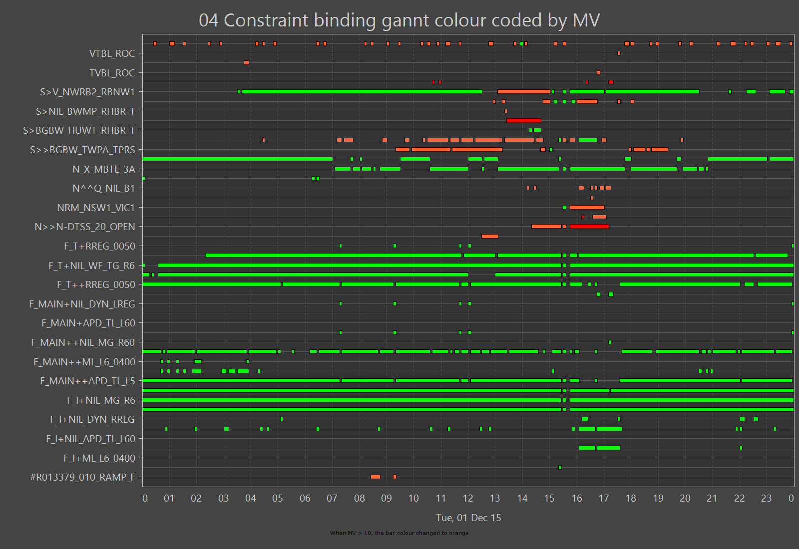
In this gannt chart we are colourising each bar based on the marginal value. If its > 1000 then its read else if > 10 then orange. The chart also shows the use of a different theme - in this case "dark". Themes are a final report style and can be easily selected from the toolbar. The chart also includes two "candy canes" as we call them to show the last dispatch interval and the last Pre5Min interval.
With NEO you can add notes to any chart. The text and the colour of the note are dynamically generated from data.
.png)
This shows actual and forecast semi and non scheduled generation with p5min and predispatch forecasts. The candy cane indicates the last dispatch interval. The chart also shows NEO's ability to chart data with different periodicity (5 and 30min).
.png)
This just highlights NEOs ability to combine chart styles and units.
.png)
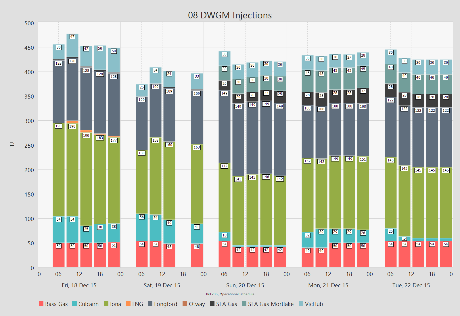
This is a bar chart of DWGM (Vic gas) injections with labels to show actual amounts.
WE ARE CONTINUALLY ADDING NEW FEATURES
If you have any suggestions please send them to us and will consider it for inclusion in our next version.
IES provides powerful online tools for electricity and gas market data analysis, visualisation and simulation.
+61 2 9436 2555info@iesys.com
www.iesys.com
DATA ANALYSIS
Products / Services
MARKET MODELLING
Product and features
© 2026 Intelligent Energy Systems. All Rights Reserved. | Privacy Policy